


TL;DR
- Healthcare branding is identity + positioning + naming + voice + visual system, built NMC + ASCI + DPDP-aware.
- ICG runs a 5-layer system (identity, voice, visual, digital, physical) in a fixed sequence, not a logo-only exercise.
- Pricing runs project-based: solo clinic identity from ₹49,999, hospital-chain rebrands ₹18L–25L+.
- Engagements take 6–22 weeks depending on scope, from solo identity to full hospital-chain rebrand.
- Naming, logo systems, colour and typography all get healthcare-specific rules most generalist studios skip.

Healthcare brands built to compound trust.
Identity, positioning, naming, brand story and visual system for healthcare brands — engineered to build patient trust over time. NMC + DPDP-aware. From single-clinic identity to hospital-chain rebrands.
What is healthcare branding and why does it matter for clinics in India?
Healthcare branding is the systematic engineering of identity (name, logo, colour, type), positioning (what the brand stands for), story (the founder/clinical narrative), tone of voice, and visual system across every patient touchpoint. Unlike generic branding, healthcare branding must navigate NMC Code of Ethics restrictions on superiority claims and testimonials, ASCI advertising guardrails, and the DPDP Act 2023 for any patient-facing data or imagery — while still building the trust that converts research-stage patients into bookings. Typical engagement: discovery (2 weeks) → positioning (2 weeks) → identity (3–4 weeks) → roll-out (4–6 weeks). Solo doctor identities start ₹1.5L; hospital-chain rebrands run ₹18L–25L+.
Why healthcare branding is different from every other branding.
Most branding advice online was written for D2C, SaaS, or lifestyle. It doesn't survive contact with a fertility clinic in Faridabad or a 250-bed hospital in Indore. Healthcare branding is a different discipline — not because the design tools change, but because the ground you stand on changes.
Six differences sit under everything that follows. Each one, on its own, would demand a different craft. Stacked together they mean healthcare branding cannot be run out of a generalist studio playbook and expected to survive contact with the real world.
Start with the trust weight. A patient choosing a shirt makes a low-stakes decision. A patient choosing a surgeon makes a life-shaped one. That asymmetry runs through every brand touchpoint. A colour that reads "premium" in fashion can read "cold" in a paediatric clinic. A tagline that lands as "confident" in fintech lands as "boastful" — and NMC-actionable — in healthcare. Weight everything.
Then come the regulatory boundaries. Three sit on top of every healthcare brand in India in 2026. The NMC Code of Ethics restricts superiority claims, doctor-patient testimonials that imply cure, and images used without written consent. ASCI's Advertising Code for Healthcare polices "leading", "best", "most trusted", "guaranteed", and celebrity-endorser use. The DPDP Act 2023 governs every patient photograph, story, review, and data trail the brand collects. A brand system that isn't NMC-safe and ASCI-clean by design will get quietly muted every time you try to activate it — Meta ad rejections, GBP suspensions, take-down notices from state councils. You do not want to discover this on launch week.
The emotional stakes shape voice more than most founders realise. A patient reading your website is usually anxious. Sometimes scared. Often researching for a parent or a spouse. Copy that would be witty on a food-tech landing page reads as flippant on a cancer-care page. Confidence in healthcare is expressed as clarity, not as swagger. Warmth is expressed as specificity, not as adjectives. This is why sentence rhythm matters as much as the wordmark.
There is a deeper form of this stakes issue: the audience is almost never one person. When a patient books a gynaecology consult, her mother is reading the website over her shoulder. When a father books a cardiology second opinion, his adult daughter is Googling the hospital reviews. When a couple books an IVF consultation, they are reading the site in parallel from two phones and cross-checking. Every healthcare brand is really talking to a small committee, and the committee includes members with very different levels of medical literacy, English fluency, and prior clinic experience. Design the voice for the least confident reader in that committee. That is who will decide whether the family calls.
And finally the part almost no agency talks about: the referral loop. Healthcare grows on referrals — patient to patient, GP to specialist, gynaecologist to IVF centre, physician to cardiac hospital. A brand that lives only in patient-facing channels leaks half its power. The brand system has to work on a referral pad, on a doctor's WhatsApp business profile, on a pharmacy shelf-talker, on a specialist directory entry, on an insurance TPA network sheet. If your logo only looks like a logo on Instagram, you have a design, not a brand.
The referral loop has a specific artefact most brands forget entirely: the referral-doctor kit. This is the small pack of collateral a specialist gives to the GPs, gynaecologists, or physicians who might refer patients to them. A short, dignified profile card. A one-page treatment-protocol summary. A brief on which patient profiles to send. A direct WhatsApp number that lands with the specialist's coordinator, not a general enquiries line. Referring doctors do not choose where to send their patients based on marketing — they choose based on the ease of the referral logistics and the quality of the clinical feedback loop. The referral-doctor kit is where the brand shows up for that decision. We build it into every clinic and hospital engagement and it is the single most under-utilised asset in most specialist practices.
There is one more difference that only shows up on year three of running a healthcare brand. Compounding. A D2C brand can be reset every 18 months without a business consequence — patients don't build long relationships with a t-shirt label. A healthcare brand cannot. Your gynaecologist, your cardiologist, your dentist — patients stay with these providers for years, often decades. The brand equity compounds inside individual patient relationships, inside GP referral memories, inside pharmacy staff word-of-mouth, inside network insurance lists. Reset the identity too often and you throw the compounding away. We have watched an anonymised diagnostics chain do three rebrands in five years chasing "modern" — the third one destroyed enough recall that new patient acquisition cost went up 40% within two quarters. Brand should evolve; it should very rarely start over.
That is the reason we do not run healthcare branding as a hand-off from a lifestyle studio. We do it in-house, healthcare-only, and we do it right — right diagnosis of what the brand needs, right positioning to earn the referral, right systems so nothing leaks between the wordmark and the pharmacy shelf-talker. We Do It Right — the right process, the right systems, the right ecosystem — is not a tagline for us. It is the discipline that keeps a ₹6-lakh brand engagement compounding into ₹6 crore of lifetime patient revenue five years later.
The 5-layer healthcare brand system ICG builds.
Every ICG brand engagement builds the same five layers, in the same order. Get the first layer wrong and the fifth layer wobbles. This is the frame our design lead Sabhyaa uses on the first workshop day with every founder.
Identity
Name, logo, wordmark, symbol, colour palette, type system. The fixed atoms — designed once, protected forever. Trademark search, .com/.in availability, Hindi/regional transliteration all live here.
Voice
How the brand speaks. Copy style, sentence rhythm, patient-safe framing, forbidden words (NMC + ASCI list), do/don't examples for enquiry replies, GBP posts, WhatsApp templates. Voice is where compliance actually lives.
Visual
Photography direction, iconography set, illustration style, motion tokens. Real doctor headshots. Real patient environments where consent allows. Stock only as fallback, never as first resort.
Digital
Website, GBP, Instagram, YouTube, WhatsApp Business. The channels where 90% of first impressions actually happen. Templates for every recurring post, so the visual layer stays consistent across 200 posts a year without your team burning out.
Physical
Signage, wayfinding, uniforms, prescription pads, appointment cards, patient welcome pack, discharge folder. The parts a patient actually holds and touches. The proof, at eye level, that the brand you promised online exists offline.
We build all five in sequence. Skip Layer 2 (as most studios do) and the roll-out fails within a quarter because the front-desk team has no voice guide to fall back on. Skip Layer 5 and the brand you built on Instagram dies at the reception desk.
The sequence matters as much as the layers. Identity has to lock before voice, because voice references specific words, phrases and positioning language that only exist after positioning has been signed off. Voice has to lock before visual, because photography direction is written to serve the voice — a formal-institutional voice needs a different frame from a warm-generalist voice. Digital has to come before physical, because signage vendors and uniform tailors need finished art files that can only be exported once the digital templates are done. Miss the order and either work has to be re-done or the brand ships out of sync — logo on signage doesn't match logo on website is the single most common launch-week bug we get called in to fix.
Brand voice and the forbidden-words library every healthcare brand needs.
Every ICG healthcare brand ships with a voice guide the front desk can actually operate. Not a mood board with "confident yet warm" written under a stock photo — a working guide with real sentences, forbidden phrases, and paste-ready templates for the twelve most common patient-facing situations. This is the layer most brand engagements skip entirely, and it is the layer that decides whether the brand you designed survives the first week of real-world use.
The forbidden-words list. Every healthcare brand voice guide we ship includes a live list of words and phrases that must never appear in patient-facing communication. "Cure" (implies guaranteed outcome — NMC risk). "Best" / "top" / "leading" / "no. 1" / "India's premier" (ASCI risk). "100% safe" (regulatory risk). "Painless" (subjective outcome claim). "Only" as in "only clinic that does X" (verifiable-claim risk). "Miracle" / "revolutionary" / "breakthrough" (hyperbole risk). "Guaranteed" / "no risk" / "zero complications" (outcome risk). The list is specialty-tuned — aesthetic dermatology adds "flawless" and "perfect"; IVF adds "sure-shot" and "definite pregnancy"; dental adds "permanent" for procedures where honesty requires "long-term". A brand that respects the list stays out of state medical council files. A brand that ignores it is one complaint away from a take-down.
The safe-alternative library. Every forbidden word has a compliant substitute we teach the team to use. Instead of "cure" → "treat" or "manage". Instead of "best" → "specialist" or "focused". Instead of "guaranteed" → "our approach" or "evidence-led". Instead of "painless" → "comfortable" or "minimally-invasive". Instead of "100% safe" → "risk-managed" or "protocol-driven". The substitution is muscle memory after two weeks of use. Without the library, the front desk defaults to the forbidden version because that is what patients ask for — "is this treatment safe, doctor?" wants a strong reassurance, and if the team is not trained on the compliant version they will give the non-compliant one.
The twelve real-world templates. Enquiry reply on WhatsApp. Appointment confirmation. Appointment reminder (24h + 2h). Post-consultation follow-up. Post-procedure care instructions. Missed-appointment nudge. Review request (NMC-safe wording). Negative-review response (public + private). Cost quote reply. Insurance clarification. Emergency-line handling. GBP post caption. Twelve situations, one paste-ready template each, all in the brand voice, all NMC-cleared. Front desk stops writing bespoke replies. Response time drops. Voice stays consistent across a hundred staff over a hundred weeks.
Voice-drift audit. Every 90 days we sample 25 real front-desk WhatsApp replies (anonymised, patient information redacted) against the voice guide. Drift always creeps in. New joiners. Rushed weekends. Bilingual moments where English drops for Hindi and the tone slips. The 90-day audit is how the voice stays in shape year after year. Brands without this audit lose their voice inside twelve months, and nobody notices until a patient complaint escalates.
The voice layer is invisible in a portfolio shot. It does not photograph well. It also decides, more than the wordmark, whether your patients feel like they are speaking to a real brand or a random front-desk person. Skip it at your peril.
Six sub-services. One controlled process.
Brand discovery + audit
Stakeholder workshops, competitor audit, patient perception research.
Naming + positioning
Naming for new ventures, positioning statement, brand pillars, value props.
Identity + logo system
Logo, colour, typography, iconography, photography style, signage.
Brand story + tone
Narrative architecture, brand voice guidelines, message hierarchy.
Roll-out + collateral
Website + signage + stationery + uniforms + digital + clinical assets.
Brand guardrails
Brand book, do/don't templates, NMC-compliant communication library.
Doctor-brand vs Institution-brand vs Chain-brand — pick your architecture first.
Before we touch a colour or a wordmark, we ask one question: which archetype are you? Get this wrong and the identity will be fighting the business for the next five years.
Doctor-brand. The founder-specialist is the brand. Think a well-known IVF specialist, a celebrity dermatologist, a senior orthopaedic surgeon whose name pulls the diary. The brand system here has to make the individual look inevitable — the logo often incorporates the doctor's name or monogram, the tone speaks in first person, the website has one primary headshot-driven hero, and the story is built around the doctor's clinical journey. Risk: succession. When the founder-doctor exits, the brand can collapse in a quarter. Mitigation is a sub-brand strategy from day one — the doctor's name sits above a clinic name that can outlive them. We have watched this go wrong twice this year with clients who came to us for a rebrand after the founder started planning retirement.
Institution-brand. The clinic or hospital is the brand; individual doctors sit under it. Think a hospital everyone in a district knows by the building, not by the chief medical officer. Identity has to feel like a system, not a person — geometric symbols, institutional colours, formal typography, a story built around the founding intent and the promise to the community. Risk: coldness. Institutional brands can drift into charmless, corporate-hospital territory that fails to convert warm-lead patients. Mitigation is putting warm doctor-led content on top of the institutional frame — patient story videos, "meet the specialist" pages, human-scale interior photography. The wordmark stays formal; the content layer stays human.
Chain-brand. Multiple locations, multiple specialties, sometimes multiple business models under one master brand. The hardest of the three. Identity has to work across a solo diagnostic centre, a 200-bed hospital, and a specialty super-clinic — and stay recognisable in each. Architecture matters more than aesthetics. You choose one of three sub-brand models: branded house (one name, everything under it), house of brands (each unit keeps its acquired name), or endorsed brands (each unit keeps its name plus a "by [chain]" endorser). Most Indian hospital chains we work with land on endorsed brands because they grew through acquisition and cannot afford to torch local equity.
We have led all three archetypes in the last twelve months — an anonymised aesthetic doctor-brand in South Delhi, an anonymised single-site multispecialty hospital in Rajasthan, and an anonymised diagnostics chain across four states. Different frames, different design decisions, same underlying five-layer system.
Branded house · House of brands · Endorsed brands — the sub-brand decision.
The moment a healthcare business has more than one entity — a second branch, a second specialty, a spin-off diagnostics arm, an acquired clinic — a sub-brand architecture decision is on the table whether the founder recognises it or not. Get this wrong and either the master brand is diluted by its children or the children are strangled by the master. Three models, three trade-offs, one right answer per business.
Branded house. One master brand, every sub-entity uses the master name. "MayaHealth Cardiology", "MayaHealth Diagnostics", "MayaHealth Fertility". Advantages: marketing spend compounds across every touchpoint; a patient who trusts the cardiology arm trusts the fertility arm on day one; brand-search volume aggregates into a single term. Disadvantages: every unit inherits the reputation of every other unit — one PR incident in one arm hits all of them; every new specialty launch is constrained by the master brand's positioning. Right for: founder-led businesses building a coherent multi-service network, greenfield builds, and any chain small enough that centralised brand governance is realistic.
House of brands. Every unit keeps its own name, the master brand is invisible to patients. Common in acquisition-heavy healthcare groups where each acquired clinic had local equity worth preserving. Advantages: local recall is preserved; each brand can serve a specific price point or demographic without pulling the others; reputational incidents stay contained. Disadvantages: zero marketing leverage across brands; every launch is a cold start; corporate identity is confusing to referral doctors, insurance networks, and staff. Right for: private-equity-backed groups, acquisition roll-ups, and multi-format businesses (a premium chain + a value chain + a diagnostics chain that would confuse each other under one master).
Endorsed brands. Each unit keeps its own name plus a "by [Master]" or "a [Master] group brand" endorser. "MayaTeeth · a MayaHealth group brand". "Cardiapex · a MayaHealth cardiology specialty centre". Advantages: local equity is preserved but master-brand halo transfers; corporate credibility (which matters for insurance networks and referral doctors) is visible; specialty positioning stays sharp under a general master. Disadvantages: brand system is genuinely harder to design — you are building parent + child rules that must work in every combination; master-brand governance overhead is real. Right for: growing hospital chains, groups with 5–25 units, and any healthcare business whose founder wants the option to promote both the group and the individual unit depending on context.
In our last twelve months of hospital-group work, endorsed brands has been the right answer for four out of five clients. It is not because it is fashionable — it is because Indian healthcare groups almost always have a mix of built and acquired units, and endorsed brands is the only architecture that respects both.
We deliver the sub-brand architecture as a written decision document in the discovery phase, signed off by the founder before a single mark is drawn. Doing this backwards — designing the identity first and forcing the architecture to fit — is how brand systems collapse in year two.
Naming a healthcare brand in 2026: 8 rules from real launches.
Bad names kill brands quietly. They pass every internal review, then fail at the trademark stage, or the domain stage, or the regional-language stage — and by then the founders are three months in and emotionally committed. These are the eight filters we run every candidate name through, in order.
1. NMC + ASCI-safe on its face
No superlatives baked in. "Premier", "Elite", "Best", "Advanced" (in a claims sense), "Leading", "India's #1" — all get flagged. A hospital called "Premier Heart Care" is starting every ad with an ASCI liability. Neutral, descriptive, or coined names outlast slogan-names.
2. Trademark-clearable in Class 44 (and often 42, 41, 5)
We run every finalist through the IP India TM search before the founder sees it. Class 44 (medical services) is the primary. Depending on the model, Class 42 (tech), Class 41 (education), and Class 5 (pharmaceuticals) matter too. A cleared TM at the naming stage saves six-figure rebrands later.
3. .com and .in both available (or at least .in + a strong .co)
If the .com is squatted at ₹18 lakh, either your budget accepts it or the name is dead. Domain availability is a naming constraint, not an afterthought. GBP does not care, but Google does — and the .com is still the trust flag Indian patients look at when they land on a landing page.
4. Hindi + regional-friendly pronunciation
Your reception phone will say the brand name a hundred times a day. If it doesn't pronounce cleanly in Hindi, Punjabi, Tamil, Telugu, Bengali, Marathi — pick the ones that match your catchment — patients will mangle it. Mangled names travel worse in word-of-mouth referral, which is the single biggest lead channel in Indian healthcare.
5. No accidental clinical-cure implication
"Cure", "Heal", "Restore", "Fix" — safe for wellness, dangerous for regulated medical. The moment the name implies guaranteed outcome, every ad and every claim inherits that liability. We keep clinical-outcome verbs out of the name and put them, carefully, into voice and content instead.
6. Passes the WhatsApp voice-note test
Say the name into a WhatsApp voice note. Send it to five people who don't know the brand. Ask them to reply with the spelling. If more than one gets it wrong, the name is a spelling problem, and spelling problems become GBP-search problems, become "how do I find you online" problems.
7. Search-competitive but not search-generic
"Delhi Dental Clinic" is search-generic — you're competing with 4,000 pages that have that string. "MayaTeeth Delhi" is search-competitive — distinctive, indexable, ownable. Distinctiveness compounds into brand-search volume; genericness dilutes into it.
8. Founder emotionally shortlists last, not first
The founder picks from a filtered shortlist — never from a first-day gut favourite. Every "I love this one" name we've seen skip filters 1–7 has come back for a rebrand within three years. We enforce this even when it slows down the founder-workshop. It is the single highest-ROI rule on the list.
A ninth, unofficial rule we have added in the last two years: the name has to survive an AI Overview citation. When ChatGPT, Perplexity, or Google's AI Overview cites your brand as "a clinic in Bangalore that focuses on paediatric dermatology", the name has to sit inside that sentence naturally. Coined names too generic ("Care Plus", "Med Life") get paraphrased away — the LLM cites the description, not the brand. Distinctive coined names ("MayaTeeth", "Cardiapex") get cited verbatim. Distinctive is not just a print consideration any more. It is a discovery consideration.
And the meta-rule underneath all eight: a name is a 10-year decision, not a 10-week decision. Most rebrand engagements we take on are cleaning up naming choices made in a rushed founder weekend three or five years earlier. The naming module is where our team pushes hardest for the founder to slow down. It is the layer where slowing down saves the most money.
Logo systems that actually work in healthcare.
A healthcare logo has an unusually wide job description. It has to sit as a 16-pixel favicon in a browser tab, a WhatsApp Business profile picture at 128 pixels, an Instagram profile ring at 320, a print prescription pad at 300 DPI, a five-foot acrylic hospital signboard, a doctor's white-coat embroidery patch, and a two-line footer on a discharge summary. Most logos designed by generalist studios are optimised for one of these — usually the Instagram profile — and quietly collapse in the other seven contexts.
A working healthcare logo system therefore is not one mark. It is at least four.
Primary lockup — full wordmark plus symbol, used on the website hero, the letterhead, the reception wall. Designed for horizontal contexts with room to breathe. Stacked lockup — symbol on top of wordmark, used for square contexts like GBP category images, Instagram grid posts, WhatsApp Business. Symbol-only — the standalone mark, used at small sizes, embroidery, favicon, mobile app icon. This is the one that fails most often; if it does not read at 32 pixels, it is not a symbol, it is a decoration. Reversed / single-colour — the mark that survives being stamped in silver on a white coat, printed in one colour on a rubber stamp, or reversed out on a dark video background. Test it in one flat colour before shipping the full palette.
Then there is the healthcare-specific consideration nobody warns you about: doctor-headshot compatibility. Half the brand's Instagram grid will pair the logo with a doctor's face. Half the website heroes will do the same. If the logo has aggressive counter-forms, thick strokes, or a busy symbol, it will fight every headshot it sits next to. We build a "logo-on-face" composition rule into every guide: a specific corner, a specific size ratio, a specific opacity for stories, so the visual language stays quiet enough to let the doctor be the hero of the frame.
Colour count matters too. A three-colour gradient logo is a designer's toy and an accounts-payable person's nightmare. Every extra colour multiplies the pantone-match cost on signage, uniforms, and print. Two-colour logos are the pragmatic default; a single-colour mark that scales up to two when needed is even better. The most enduring hospital logos in this country are one or two colours, geometric, and older than the internet — that is not a coincidence.
Finally: versatility documentation. The delivered brand book has every use-case spelled out — clear-space, minimum sizes, background rules, do-nots. Without this the reception intern will stretch the logo, the freelance video editor will add a drop-shadow, the printer will rebuild the wordmark in Comic Sans. It happens more than you think. The brand book is the fence that keeps the identity from erosion.
A specific test we run every logo through before shipping it: the 12-context grid. The mark is mocked up at real scale in twelve real contexts before the founder signs off — favicon, mobile app icon, WhatsApp DP, Instagram profile, YouTube channel avatar, GBP profile image, letterhead footer, prescription pad, embroidered coat patch, three-storey backlit signage, business card, doctor lanyard. If it fails in any two, we go back to the drawing board. Half of the logo redesigns we see in the industry could have been avoided by running this test at draft-lockoff instead of after the founder had lived with the mark for a month.
Symbol systems deserve special care in a country where the tulsi-leaf, the caduceus, the ashoka-chakra, and the lotus are all overused to the point of invisibility. If your symbol looks like every third healthcare brand on the street, it is doing nothing for you. Distinctive geometry — a monogram, an abstract mark, a specialty-specific abstraction — is worth the extra week in the design phase. The best-performing healthcare marks we have shipped in the last two years have zero literal-medical iconography. They earn credibility through voice and photography instead of leaning on a stethoscope silhouette.
And a warning about trend-chasing logo aesthetics. Every 3–4 years a new visual fad sweeps healthcare branding — flat-line 2015, gradient 2020, bento-modular 2024. A logo built on the fad ages badly and forces a refresh in year three. Timeless geometry outlasts every fad. When in doubt, build the mark that would have looked serious in 2005 and will still look serious in 2035.
Colour palettes for healthcare — beyond blue and green.
Every Indian hospital brand book from 2005 to 2015 uses either navy blue or hospital green. It became the default because it read as "clean" and "safe". It is no longer differentiated. In 2026, if your identity uses standard blue, you look like every mid-tier chain in the country and lose the visual battle before a patient reads the wordmark.
The palette is a positioning statement. Deep teal reads clinical-modern. Warm terracotta reads paediatric or wellness. Muted forest reads Ayurveda without shouting it. Cream and umber read premium-aesthetic. Cool graphite plus a single accent reads specialist-elite. Warm gold plus deep burgundy reads legacy-institutional. None of these are gimmicks. Each one is a decision about what kind of trust the brand is asking the patient to feel.
Sub-specialty conventions matter, but only as gravity, not as rules. Cardiology settles on deep reds and confident blues — deviating too far requires a reason. Paediatrics tolerates brighter, warmer, more playful ranges — over-playful loses the parents. Oncology stays serious, muted, and warm. Fertility is the most delicate: too clinical feels cold to a couple who has been trying for four years, too warm reads unserious to a couple who has already spent ₹8 lakh across two cycles. We build the palette in a specialty-aware way, then stress-test it against the founder's real patient personas.
Accessibility is a compliance issue, not an aesthetic one. Every brand palette we ship passes WCAG AA contrast for body text on both light and dark surfaces. A 4.5:1 ratio for normal body copy, 3:1 for large text. The number of Indian healthcare websites we audit that fail this basic bar is depressing — light-grey copy on white is not "elegant", it is unreadable to a 60-year-old patient with early cataracts, which is the exact demographic your cardiology or ophthalmology brand needs to serve.
Print reproduction is the palette test most brand launches skip. A CMYK build sample gets printed on the actual signage vendor's material, the actual prescription paper, the actual uniform fabric — before the palette locks. Screen-perfect teal becomes muddy grey on the wrong signage substrate. Deep burgundy becomes brown on uncoated stock. If you have not seen the colour in the real material, you have not shipped the palette.
We deliver every palette with primary, secondary, and support tiers, plus a documented "do-not-use" list of near-neighbours that dilute the brand. The point is not to give designers infinite freedom — it is to give the reception intern one poster template where the colour choice is already made.
One nuance worth naming: the "functional colour set" that sits alongside the brand palette. Green for success/confirmation, red for error/alert, amber for warning, blue for information. Every healthcare website will need these for booking confirmations, form errors, appointment reminders, cost breakdowns. If the brand palette is teal + terracotta, and the functional greens/reds/ambers are not consciously chosen to sit next to that palette, the site will look chaotic every time a form loads. Our brand books ship with a coordinated functional set as a fifth palette tier. Small detail, big compounding effect.
And a specific note on festival and seasonal creative. Every Indian healthcare brand gets asked to post Diwali, Independence Day, World Cancer Day, World Diabetes Day, Doctor's Day. Without palette-safe festival extensions, the social team defaults to standard festival colours (red-and-gold Diwali, orange-white-green Independence) and the grid looks like it belongs to a different brand for that week. We build a "festival-extension palette" — how to bring in the festival tone using the brand's own accent colours — into every guide. Small but the compounding across 15 festival moments a year adds up.
Typography that patients read — not just designers approve.
Type in healthcare has one job the designer's studio often forgets: your reader is anxious, on a phone, in bad light, and sometimes over 50. Every type decision either helps that reader or fights them. Style is optional. Legibility is not.
Body sizes start at 16px on mobile, not 14. Reading a treatment cost page at 14px on a mid-range Android with the brightness at 30% is a squint job. 16 is the floor; 17 or 18 is the safer ceiling for treatment pages, symptom pages, and anywhere a patient is expected to actually read past the first line. This is the smallest change we make on 90% of the healthcare-website audits we run, and it is often the change that lifts conversion the most.
Line-height is where legibility lives or dies. 1.6 on body copy, 1.3–1.4 on H2s, 1.2 on display H1s. Anything tighter and the paragraphs collapse into a wall. Anything looser and the page starts to feel spammy. Consistency across the type system matters more than any single value.
Two typefaces, not five. A headline face and a body face. Sometimes one super-family that carries both. Any more and the brand starts to smell like a template. The headline face is where the personality of the brand lives — geometric-modern for clinical-tech, humanist for warm-generalist, high-contrast serif for legacy-premium. The body face should be quiet, boring in the best sense, and available on Google Fonts so it renders on every device the patient is on.
Hindi / Devanagari pairing is not optional if you operate anywhere north or central India. Every treatment page will eventually get a Hindi translation, a Hindi Google Ads landing page, or a Hindi WhatsApp broadcast. The English face has to pair with a Devanagari face that carries the same tonal weight — Noto Sans Devanagari and Mukta pair well with most modern sans-serifs; Tiro Devanagari Hindi pairs with humanist serifs. If you ship a brand book without the Devanagari pairing named, you are handing the problem to a junior designer three months later, and they will guess wrong.
Mobile-first weight choices. Ultra-light and hairline weights look beautiful on a 27-inch Retina display in the studio. They vanish on a 6-inch phone in a train. We default to regular for body, semibold for emphasis, bold for H2s, and reserve heavier weights for display use. Simple, boring, works.
Type is one of the few brand layers where the design lead does not get the last word. The last word belongs to the 55-year-old patient reading the appointment-confirmation email at 8pm with two-star Wi-Fi. Design for that person.
A few specific pairings that have worked well for us across healthcare briefs. Inter + Merriweather for clinical-modern-with-warmth. General Sans + Fraunces for premium-aesthetic. DM Sans + Playfair Display for legacy-formal. Public Sans + Newsreader for institutional-serious. Manrope + Cormorant Garamond for boutique-specialist. Each has a Devanagari companion that carries similar tonal weight. None of these are mandatory choices — they are just pairings we have tested in real briefs and know render cleanly across the Android device landscape our patients are actually on.
A note on numerals. Every healthcare website has a lot of numbers — costs, phone numbers, appointment times, bed counts, years-of-experience. If the body face has awkward numerals (some geometric sans-serifs render digits inconsistently between tabular and proportional forms), the numbers-heavy pages look sloppy at scale. Test the numerals specifically in a mock cost table before locking the face. Small check, saves a lot of retro-fitting.
And a note on type in the doctor byline. The line "Reviewed by Dr Firstname Lastname, MD, DM (Cardiology)" appears on every treatment and condition page a serious healthcare brand publishes. If the type treatment for that line is sloppy — cramped, low-contrast, misaligned with the credentials — Google's E-E-A-T signal reads weaker and patient trust reads weaker. Design the byline treatment as a first-class component, not an afterthought.
Photography direction for healthcare brands.
A patient can spot stock imagery within a second. Blue-lit surgeon holding a tablet. Diverse group of models in scrubs laughing at nothing. Close-up of hands with latex gloves. Every one of these signals "we did not spend on our own photography, we bought it from a shutterstock plan for ₹4,800". The trust cost is enormous. The fix is not expensive.
Real over stock, always. A one-day shoot at the clinic — the actual reception, the actual consultation room, the actual doctor in the actual white coat — delivers 40 to 80 usable images that cover a full year of website hero rotations, Instagram grid posts, ad creatives, and GBP posts. Cost: ₹35,000–₹75,000 for a good healthcare-experienced photographer in most Indian metros. Return: every visual asset stops lying.
Patient photography needs written consent under DPDP. Every patient image, testimonial video, or before/after still requires DPDP-compliant consent — specific to the use case, revocable, logged. We ship every brand system with a consent template our compliance layer has cleared, plus a workflow the front desk can actually operate. Missing this on launch day is a complaints-to-state-medical-council risk that is entirely preventable.
Doctor headshots that convert. This is the single most-viewed asset on most healthcare websites. Get it wrong and the "Book Consultation" button underperforms by 25–40% no matter how good the copy is. Rules from our shoots: eye contact with camera (not with the ceiling, not at a distance), soft warm side-light (not the harsh overhead LED of a clinic room), open posture (not crossed arms), a background that reads clinical but not sterile, a real white coat (not a rented one, not a doctor-in-scrubs cosplay). Same wardrobe, same lighting, same crop across the entire specialist team — the visual continuity is what makes the "meet the doctors" grid look like a hospital and not a directory.
Environment photography beats posed photography. The reception at 4pm with actual patients (blurred if consent is not there), the consultation-room light through a window, the pharmacy shelf, the diagnostic machine mid-scan. The frame composition, not the model, is what makes the environment feel real. This is where the brand actually lives — not in the polished studio shot the founder was hoping for.
We build a shot list at the discovery stage, brief the photographer specialty-first (a cardiology brand is not a paediatric brand), and hand the client a locked photography-style guide with sample framings, do-not examples, and a monthly refresh cadence. Photography is not a one-time asset. It is a subscription.
Two more considerations that decide whether the photography lifts the brand or drags it.
Colour grade consistency. Every shot from every session over 24 months has to look like the same brand. This means a locked LUT (colour grading recipe) delivered to every photographer and video editor who touches brand assets. Without the LUT, one session shot in warm afternoon light and one shot under cool clinic LEDs will look like two different brands inside the same Instagram grid. The LUT is boring, technical, and skipped by most brand deliveries. It is also the difference between a coherent-looking healthcare feed and a chaotic one.
Doctor-video framing. As doctor-led YouTube and reels become the dominant awareness channel for Indian healthcare in 2026, video framing has to match the still-photography brand rules. Same lens length (85mm equivalent for headshot-safety, 35mm for environmental), same colour grade, same background rule, same lower-third type treatment. If the doctor's still portrait on the website and the doctor's talking-head video on YouTube do not look like the same brand — same doctor, but different visual language — the trust equity leaks across channels. We ship every brand book with a "video framing rules" annex specifically for the client's video vendor or in-house team. This is what YODA enforces on the video governance side.
Specialty-aware healthcare branding.
Website as brand asset — 12 patterns that convert.
The website is the single largest brand surface most healthcare businesses will ever build. Not the largest by size — the largest by number-of-first-impressions-made. For most clinics, 60–75% of first patient encounters happen on the phone screen, not at the reception. If the brand fails there, no downstream marketing repairs the damage.
Twelve patterns show up in every high-converting healthcare site we have shipped or audited.
One. Hero above the fold that names the specialty, the city, and the promise — in three lines, not a paragraph. Two. A "chat with a doctor on WhatsApp" CTA within thumb-reach on mobile, not tucked into a form. Three. A trust bar under the hero — years of practice, procedures done, patients served — verifiable numbers only, no puffed claims. Four. A treatment-page pattern that starts with cost transparency (a range if you cannot commit to a number), then process, then outcomes, then FAQs. Not the other way around. Five. Doctor pages that read like biographies, not directory entries — where the doctor studied, what they have published, what conditions they see most. Six. A patient-stories block that respects NMC — no cure claims, no before/after with medical outcome text, first-person quotes only where consent is on file. Seven. An appointment-booking flow that assumes a mobile-first, low-bandwidth user — three fields, one screen, WhatsApp confirmation. Eight. Location pages for every branch that treat each branch as a first-class citizen with its own GBP-linked hours, doctors, and directions. Nine. A "how to prepare for your appointment" content block — the single highest-utility page for anxious first-time patients, and the single most-under-built page across the sites we audit. Ten. An accessibility pattern — keyboard-nav, WCAG-AA contrast, alt text on every doctor image — that also doubles as a compliance moat. Eleven. A brand-native colour and type system, not a template — the site must look like the same brand as the signage, the WhatsApp DP, the prescription pad. Twelve. Page load under 2.5 seconds on 4G. Every extra second is a measurable drop in "chat with doctor" click rate. This is engineering, not design, but the brand pays the bill if it is not enforced.
The pattern set is not a checklist. It is a diagnostic. If a live site is missing five or more of the twelve, a website rebuild is usually more valuable to the business than a logo rebuild — and we will tell the founder that on the first call, even if it means a smaller engagement for us.
One pattern deserves its own paragraph: cost transparency. Every serious healthcare buyer in 2026 has been bruised by a clinic that quoted "starting at ₹X" on the website and delivered a "final quote" three times that in the consultation. Patients have learned to distrust the low-anchor number. The counter-move is to publish honest ranges — "root canal ₹5,500 to ₹18,000 depending on tooth position and canal count", "hair transplant ₹65,000 to ₹2,20,000 depending on graft count and technique". A range is more credible than a floor, and it filters out patients who were never going to pay your real number anyway. Every ICG-built healthcare treatment page uses ranges. Conversion rate at the "book consult" button lifts, every time.
Another one worth calling out: the doctor-page as a real biography, not a directory card. Google's E-E-A-T model rewards this heavily, and AI Overviews cite well-structured doctor pages far more than thin ones. But the reason to do it is not SEO — the reason is trust. A patient reading about a doctor who has 14 years at a named institution, three peer-reviewed publications, presented at a specific conference in a specific year, and specialises in a specific patient profile books more often than a patient reading "MBBS, MD, 10+ years experience." Specificity is trust. Vagueness is a red flag.
And a warning about pattern eleven — the brand-native colour and type system on the site: this is where template platforms fail hardest. Drag-and-drop site builders and generic WordPress themes will render a healthcare brand as approximately the brand — close enough that the founder ships it, far enough that patients notice the visual discontinuity between the Instagram grid and the website. Custom-built or well-configured template is the fork in the road; we build custom on Laravel for exactly this reason. The brand book is the reference, the site is the honouring.
Rebrand vs refresh — when to do which.
Founders often walk into the first call asking for a rebrand when what they need is a refresh — and occasionally the other way around. A rebrand is a positioning-level move: the story changes, the identity changes, sometimes the name changes. A refresh keeps the positioning intact and modernises the visual layer. The first costs ₹6–25 lakh and takes 14–22 weeks. The second costs ₹1.5–5 lakh and takes 4–8 weeks. Getting the call wrong burns either time or money — sometimes both.
Five diagnostic questions, run in order, sort most cases.
One. Has the business changed? If the clinic added specialties, moved from single-city to multi-city, entered a new patient demographic, or shifted from cash-only to insurance-network — the positioning has shifted whether the founder has noticed or not. That is a rebrand cue.
Two. Does the brand still describe what you do accurately? A brand called "Dental Care Clinic" that now runs an aesthetics and dermatology arm is misleading its own patients before they even arrive. Rebrand.
Three. Are you losing referral moments you should be winning? If GPs are referring competitors more than they refer you despite similar clinical outcomes, the brand is failing on the professional-audience layer. Voice, story, and positioning need work. Rebrand-adjacent.
Four. Does the identity feel dated but the positioning still feels right? Refresh. Modernise the wordmark, the colour, the type, the photography — keep the promise, keep the tone, keep the equity.
Five. Is there a specific compliance-driven force? NMC or state medical council action against a name, an ASCI notice against a slogan, a trademark dispute — these force a rebrand. Refresh is not an option.
We run these questions in the discovery workshop and hand the founder a written recommendation with cost and timeline for both paths. Half the time we recommend the smaller, cheaper refresh. That is not lost revenue for us — it is the reason clients come back for the bigger engagement two years later, when the business has actually earned the rebrand.
Three additional cases we run into often enough that they deserve their own names.
The "founder-transition" case. Founder-doctor is stepping back over 3–5 years; a next-generation team is taking over. The brand has been personally identified with the founder. This is the trickiest case in healthcare branding because a full rebrand risks torching the trust the founder built, but a refresh does not solve the succession problem. Answer is usually a phased evolution over 18 months — introduce a clinic-brand alongside the doctor-brand in year one, elevate the clinic-brand in year two, retire the doctor-brand-as-primary in year three, keep it as founder-emeritus after. This is the brand equivalent of a proper leadership handover, and it takes real time.
The "acquired-clinic-integration" case. A chain acquires an independent clinic with a strong local name and is trying to figure out whether to force the chain brand on it, keep the local name, or endorsed-brand it. Almost always the right answer is endorsed brand for the first 12–18 months, then re-evaluate. Immediate rebrand torches local equity; keeping the name entirely separate wastes chain-marketing leverage. Endorsed brand buys the option to migrate later.
The "compliance-forced-rename" case. Rare but real — a state medical council or the NMC takes action against a name. Timeline is compressed (usually 90 days to comply), stakes are legal, and the temptation is to just rush a new name and move on. That is exactly wrong. Compliance-forced renames are the highest-stakes moment to do the naming right, because you cannot afford a second forced rename. We slot these engagements at the front of our project queue and run them in a compressed but still-disciplined 8-week format.
Healthcare brand launch playbook — 90-day plan.
A new identity has a launch window. Miss it and the brand quietly leaks — old signage still up, old logo still on the WhatsApp DP, old templates still in the front desk's WhatsApp quick-reply library. Three months from lock-off is the realistic window to get everything switched. This is the playbook we hand every client on the day the brand book ships.
Pre-launch — Weeks -4 to 0. Order signage (long lead time, especially acrylic and backlit). Print all stationery — letterhead, prescription pads, appointment cards, discharge summary templates, envelopes. Order uniforms, embroidered patches, doctor coats. Print patient welcome pack, appointment reminder card, referral pad. Update WhatsApp Business profile, GBP profile picture, GBP cover. Build the new website on staging. Migrate content, set up 301 redirects on the URL structure that changed, hand off to SEO for pre-launch crawl. Book photography. Draft the launch announcement, the doctor Instagram carousel, the WhatsApp broadcast, the referral-doctor email.
Launch — Weeks 0 to 2. Website goes live. All social profiles switch in one hour, not one week. GBP updates in a single day. WhatsApp broadcast to existing patient base (DPDP consent verified first). Founder posts a signed letter announcing the change. Referral-doctor email goes out the same day. Old signage down, new signage up. Reception script updated. Front-desk trained on new voice. Complaints line briefed for the "why did you change the name" wave — which is real, and lasts two weeks.
Post-launch — Weeks 2 to 12. Content cadence begins — the new brand voice needs 8 to 12 pieces of published proof in the first 90 days for search engines, referral partners, and patients to trust the transition. Instagram grid re-orders around the new visual system. YouTube channel banner and video end-cards switch. Rank-tracking dashboard set up. GSC re-indexed for the new URL structure. GBP suspension risk actively monitored — brand changes are the number-one trigger for GBP suspension notices, and the fix is documented paperwork. Founder does one referral-doctor lunch per week for six weeks — the professional audience needs face-to-face reassurance that the change is upgrade, not disruption. By day 90, the brand transition is done and the new identity is the default.
Every ICG brand engagement ships with a 90-day Gantt plus a per-week WhatsApp check-in from our project lead. Left to a busy founder-doctor without support, the launch stalls at week three and the brand never fully lands. This is the boring, unglamorous part of branding that decides whether the ₹8 lakh investment compounds or fades.
A few tactical notes learned across the last 40 healthcare brand launches we have run.
Signage lead time is the single most-underestimated variable. A backlit acrylic-fronted signboard for a three-storey clinic takes 18–24 working days from art file to installation in most Indian metros — longer in Tier-2 cities. Order it at week -4, not week -2. We have seen brand launches slip by six weeks because the founder assumed signage was a one-week job.
Old-brand cleanup is a separate workstream. Deleting the old logo from the Google Business Profile is easy; deleting it from the 400 third-party listings that scraped it three years ago is a two-month project. We treat it as a dedicated citation-cleanup sprint in month one post-launch, run by our local SEO team in parallel with the brand roll-out.
Insurance-network paperwork updates take 4–8 weeks. If the clinic name is changing, TPA network listings need a fresh empanelment letter, which needs a hospital letterhead with the new name, which cannot go out until the new letterhead is printed. Sequence this backwards from launch day and start it at week -6. Patients discovering that the "new brand" is not on their cashless list because the paperwork lagged is a trust hit you do not want in launch month.
The "old brand fond farewell" post matters. A short founder-signed note on Instagram and LinkedIn on the day of the switch — a paragraph acknowledging the old identity, thanking the patients who trusted it, and explaining what the new brand is aiming to build — turns a change that patients might read as "corporate reshuffling" into "our clinic is investing in serving you better". This one post outperforms every launch-week ad we have ever run.
Reception script drift starts on day 8. The first week the front desk sticks to the new voice guide because it is fresh. By week two, individual receptionists start reverting to whatever they were saying before. A one-hour re-training at week 4 costs almost nothing and cuts drift by 60–70%. We schedule it as a default.
How an anonymised aesthetic clinic shifted brand tier in 6 months.
The client — an anonymised aesthetic dermatology practice in a Tier-1 metro — came to us with a genuinely good clinical practice trapped inside a brand that read mid-market. Average consultation ticket at engagement start was ₹1,800, average procedure ticket was ₹22,000, and the founder's ambition was to move up-market to compete with cash-heavy premium aesthetic clinics — the ones whose consultation tickets sit at ₹3,500 and procedure tickets at ₹65,000+. The brand was the blocker. Patients described the clinic as "reliable and affordable" — which is a lovely thing to hear if you are running a mid-market practice, and a death sentence if you are trying to become a premium one.
Diagnosis — Weeks 1 to 2. The name was fine, TM-cleared, distinctive. The logo was serviceable. The problem was everything downstream: photography was 80% stock, colour palette was default aesthetic-clinic blush pink, the website read like a directory, Instagram grid looked like a collage. The voice was warm but not confident — every treatment page hedged. Patients could not tell if they were being asked to book premium care or bargain care.
Move — Weeks 3 to 10. No rebrand of the name. Refreshed the wordmark by 15%, reset the palette to muted terracotta and cream with a graphite accent — a palette that reads premium-warm without shouting luxury. Rebuilt photography from a two-day in-clinic shoot: real reception, real doctor at the consult chair, real patients (consent on file) in the recovery lounge. Rewrote the treatment-page voice to be direct, cost-transparent, and outcome-honest. Rebuilt the website on a slower, deliberate scroll rhythm — fewer sections, more whitespace, larger type. Removed the "starting at ₹" price hooks that had anchored down. Replaced them with detailed procedure-cost ranges that patients could contextualise. Rebuilt the doctor-page pattern to lead with credentials, publications, and specialty depth.
Result — Month 6. Average consultation ticket lifted from ₹1,800 to ₹2,900. Average procedure ticket lifted from ₹22,000 to ₹41,000. Enquiry volume dropped 18% — which is exactly what a premium repositioning should do; the price signalling filters out patients who were never going to convert at the higher ticket. Revenue per enquiry lifted 92%. Instagram followers slowed in growth rate but engagement rate lifted. The clinic entered the consideration set of the up-market patient demographic the founder had been aiming at for two years.
Total investment: ₹4.8 lakh across the refresh, photography, website rebuild, and 90-day launch support. Payback: month five. The brand did not need a rebrand. It needed to stop apologising for its own quality.
The founder later said the line that made the workshop click was Sabhyaa asking: "would you rather have a hundred patients who cost ₹2,000 to acquire and pay ₹22,000 each, or fifty patients who cost ₹4,500 to acquire and pay ₹65,000 each?" Written down, the second is obvious. Lived, most founders default to the first because it is what the brand quietly asks for. Change the brand, change the ask.
One lesson worth stealing from this engagement: photography moved the numbers more than any other single lever. The colour reset was noticed by design-literate patients. The wordmark tweak was invisible to almost everyone. The typography change registered subconsciously. But the switch from stock hospital-lobby images to real in-clinic frames — the founder-doctor at the consult chair, the actual reception at 4pm, the recovery lounge with real diffused window light — was the change patients cited when asked why the clinic "felt different" now. Photography is the highest-signal, lowest-cost premium lever we have found in healthcare branding. Very few founders spend enough on it. Almost all of them regret that later.
What we would do differently, looking back on this engagement. Three things. One — we would have started the cost-transparency conversation with the founder in week one instead of week three. Getting a founder comfortable with publishing honest procedure-cost ranges instead of "starting-at" anchors is the single hardest positioning conversation, and it needs the most time. Two — we would have shot photography before we designed the site, not after. Designing to real photography instead of designing to a placeholder-and-hope produces a tighter site with less colour compromise. Three — we would have introduced the receptionist re-training at the launch week itself, not at the 90-day point. Front-desk drift on voice starts on day 8, and correcting it later costs more than getting it right at launch.
Every engagement teaches us something the previous forty did not. This one taught us that a refresh done well beats a rebrand done in a hurry — and that if the founder has the discipline to change how the clinic asks, the market has the intelligence to respond within two quarters.
A second case — anonymised diagnostics chain unifies four regional brands.
A different shape of engagement, worth a look. An anonymised diagnostics chain came to us with 42 collection centres across four states, all trading under four different names inherited from four different acquisitions between 2019 and 2024. The management team had been running the acquired brands in parallel — same lab backend, same reporting platform, same technical team — but marketing, signage, uniforms, sample-collection packaging, and B2B relationships were fragmented four ways. Each brand was doing okay locally. None was strong enough to command a corporate rate from a hospital or an insurance TPA.
Diagnosis — Weeks 1 to 3. The strategic question was not "which of the four names do we keep". It was "what brand architecture serves the growth plan for the next five years". Growth plan was to scale to 200+ centres and enter two more states. That growth plan needed a national brand — you cannot enter Tamil Nadu with the name of a Punjab-only diagnostics chain and expect it to work. Two of the four inherited names were regionally specific in a way that would not travel. One was phonetically difficult in South Indian markets. One was cleared for national use. The endorsed-brand architecture was the right answer — the four inherited names remain as local sub-brands (endorsed by the new master), a new master brand carries the corporate identity and national push. The management team was not initially comfortable with the endorsed model. Six weeks of stakeholder workshops and franchisee interviews got the buy-in.
Move — Weeks 4 to 18. Master brand naming, TM-cleared across three classes, .com and .in secured. Master wordmark designed to sit above each of the four local names in an endorsed-brand lockup. Palette moved from four inherited accent colours to one master palette with local-brand accent-colour retention. Sample-collection packaging redesigned around the master brand — the technician who walks into the patient's home is the highest-frequency brand moment for a diagnostics business, and it had been leaking equity in four directions. Reporting envelope, test-report layout, WhatsApp report delivery template, and payment SMS template — all redesigned. Uniforms updated for the master brand at all 42 centres. Signage updated in a phased 6-month roll-out. Website consolidated from four local sites to one master site with local landing pages per region.
Result — Month 12. Hospital B2B contracts consolidated from 34 individual regional agreements to 8 master-brand agreements at 22% better rate cards. Insurance TPA network listings unified — approval time on new TPA empanelments dropped from 6–10 weeks to 3–4 weeks because the paperwork stopped being local-fragmented. Patient walk-ins at centres in the two lowest-recall inherited brands went up 40% in the first quarter after the endorsed lockup was applied to signage. Master-brand-search volume went from zero at engagement start to 4,200 monthly searches by month 10. Two years later the chain crossed 90 centres and had raised a Series B on the corporate-brand story we architected.
Total investment across the engagement was ₹22.4 lakh — spread across strategy, master brand design, endorsed lockup system, packaging redesign, uniform redesign, website consolidation, and 12 months of governance. The founders described it as the single highest-ROI professional-services investment they had made in the business. The lesson: brand architecture is not a design decision. It is a business-model decision that happens to be expressed in design.
What made this engagement work. Three practical things worth documenting for any founder considering a similar consolidation. One — we brought all four inherited brand's regional franchise partners into three of the discovery workshops. Consolidation without their buy-in would have quietly failed at the local roll-out; with their buy-in, the signage-change resistance dropped to almost nothing. Two — the master brand was designed to be the endorser, not the replacement, and this was documented in writing on day one so the local brand owners could stop worrying that we were soft-launching a full replacement. Three — the packaging redesign was piloted at one centre for six weeks before national roll-out. The pilot caught a printing issue with the new bio-hazard tape colour combination that would have delayed the full launch by 8 weeks if it had been caught later. Pilot before scale, always, for anything that ships in physical material.
Keeping the brand from drifting — the 12-month governance layer.
Every brand starts to leak the moment the design team leaves the room. Not because anyone is careless — because the day-to-day creators of brand content are almost always juniors, freelancers, or in-house marketers who did not sit through the discovery workshop and did not read the 84-page brand book. Governance is how you catch drift in week one instead of month six.
We built our governance layer after watching too many client brands slip in months four to eight after launch. The pattern was consistent. New hire on the social team. Founder taking six weeks off. Season sale creative pushed by an outside vendor. A Diwali post that used red because red felt "festive" even though red was not in the palette. One post at a time. A quarter later the Instagram grid did not look like the same brand any more, and the founder noticed only when a referral doctor asked "did you rebrand again?"
The monthly grid audit. Our design lead pulls the last 30 days of published content — Instagram grid, GBP posts, YouTube thumbnails, WhatsApp broadcast creatives, website hero rotations — and scores each against the brand book. Colour, type, photography direction, voice. Findings are compiled into a short deck the client receives on the first of every month, with specific screenshots and specific fixes. Drift caught, drift fixed, drift not repeated. This is what Prism Pulse automates on the social layer for us.
The quarterly reception audit. Once a quarter, someone from our team calls the clinic reception line as a mystery-patient enquiry. What voice does the receptionist use? Does she quote costs in the range the brand promised? Does she offer to WhatsApp confirmation in the language the brand voice guide prescribes? The audio is anonymised and shared with the founder. Front-desk drift is almost invisible from inside; a mystery-call audit is the only reliable way to catch it.
The annual physical audit. Once a year, we visit the clinic or hospital and photograph every physical brand touchpoint. Signage still on-brand? Uniforms still using the correct fabric colour? Prescription pads still on the right paper stock? Waiting-room posters still current? Discharge summary template still branded? The list of drift items across a 40-bed hospital across 12 months is always longer than the founder expects — anywhere from 8 to 30 items on a first audit. Every one is a small equity leak. Together, they are what "the brand feels tired" looks like from a patient's chair.
The brand-central operating rhythm. For chain and hospital clients, we set up a monthly brand-central call with the marketing team + a rotating founder or C-suite representative. New collateral requests. Sub-brand launch approvals. Vendor onboarding for print, signage, photography. Emergency brand-safe communication (a crisis, a compliance notice, a celebrity endorsement offer). The rhythm keeps the brand alive as a shared discipline instead of a file on a designer's laptop.
Governance is priced as a monthly retainer separate from the identity project — ₹35K per month for solo/single-clinic, ₹75K–₹1.25L for chains, ₹1.5L–₹3L for hospital groups. It is optional. Every client who takes it renews at the end of year one. Every client who skips it comes back for a refresh within 24 months. We know because we have counted.
Brand story architecture — the founder narrative that earns referrals.
Every healthcare brand has a story. Very few have a story that has been architected. There is a difference between a founder-doctor being able to explain how the clinic started (which almost every founder can) and a written narrative that can be handed to a content writer, a referral doctor, a media journalist, a hospital tour guide, and each one uses it consistently. The architected story is the difference. Without it, the story mutates every quarter, drifts in every interview, and gets remembered wrong by the people who matter most: referring GPs, insurance TPAs, senior specialists in the network.
Three narrative layers. The founder-origin layer answers "why does this clinic exist" in one paragraph — the clinical insight or personal experience that made the founder start it. The clinical-conviction layer answers "why do we practise the way we practise" in another paragraph — the specific protocol, philosophy, or standard of care that separates the clinic from the median. The patient-promise layer answers "what does a patient get here that they would not get elsewhere" — the observable, verifiable promise that shows up in every touchpoint. Three paragraphs, tightly written, revised until every sentence earns its place. The story then becomes the source that every website page, every founder interview, every referral conversation, every recruitment pitch draws from.
What the story is not. It is not a mission statement. It is not a "vision and values" grid. It is not a founder LinkedIn essay. All of those either bore the reader or fail to survive the referral conversation. The story is specific, first-person or close to it, and short enough to be recited by memory. If a receptionist cannot summarise the story in three sentences after a month at the clinic, the story is either badly written or badly circulated. Both are fixable.
Voice-of-the-doctor problem. Founder-doctors are often busy, sometimes uncomfortable in front of a writer, and almost always underestimate how specific their clinical insight actually is. The story workshop is where our team draws out the specifics that the doctor does not think are interesting — the exact clinical protocol they insist on that most peers skip, the patient case that shaped their conviction, the moment they decided to leave a larger institution to build their own. These specifics are the story. The generalities the doctor thinks are the story are usually not.
Referral-optimised phrasing. The story has to end with a phrase that other doctors can repeat when they refer a patient. "For complex second-opinion cases in [specialty], I usually send patients to [Clinic] — they run the [specific protocol] properly, unlike most centres." That specific line is the north star of the story architecture. If the story does not lead naturally to a sentence a peer doctor can say without feeling promotional, the story is not doing its job.
We workshop the story with the founder in a two-hour session in week two of every engagement, ship a written draft in week three, and refine through two revision rounds. It becomes the source document for the website content, the doctor-page bios, the founder-media kit, the referral-doctor collateral, and the recruitment pitch. One document, five downstream uses, one consistent voice — that is what a written brand story earns.
Every Instagram post the brand ships, tracked in one view.
A brand book is one thing. A brand book actually held to across 200 posts a year is another. Every ICG brand engagement includes a governance layer — the design lead reviews a rolling 30-day content sample against the visual system, catches drift early, and re-briefs the in-house or agency creator before the drift compounds. Prism Pulse is the workspace where that governance runs.
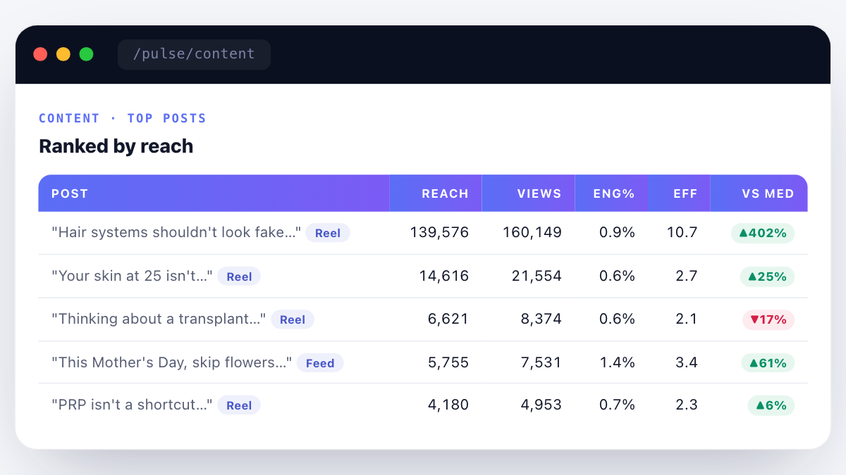
Prism Pulse → Weekly grid audit — every post tagged for brand-system fidelity: colour, type, photography direction, voice. Drift caught in week one, not month three.
From ₹20,000/month. Custom-scoped.
Every practice is welcome, from a single-doctor clinic to a multi-city hospital group. We scope your brand project to your specialty, locations and goals in a free diagnostic, so you see the exact fee before anything starts.
Every engagement runs against a written monthly goal contract, visible to you in real time on Ichelon Agency OS.
Available on top of the fixed retainer, scoped jointly at benchmarking. Payout scales with how far your goals are met.
Media spend is billed separately and stays in your own ad accounts.
What a healthcare brand system actually costs in India in 2026.
Branding pricing in India is opaque on purpose — most studios don't want to publish rate cards because it removes their room to price by client size. We publish ours because opacity is bad for the buyer, and healthcare buyers in this country deserve better. The ranges below are what a serious, healthcare-specialist studio should charge in 2026. If a quote is dramatically lower, look closely at what is missing from the scope. Usually it is Layer 2 (voice), Layer 5 (physical), or the 90-day launch support — and those are the parts that decide whether the money you spent actually compounds.
Solo doctor · personal-brand identity — ₹1.5L to ₹3L. Naming (if new), wordmark, symbol, colour, type, photography direction, one-day headshot shoot, website content and design (5–7 pages), GBP setup, Instagram grid template pack, WhatsApp Business setup, brand book. 5–7 weeks. This is the entry point for a specialist opening their own OPD or building a personal brand alongside a hospital appointment.
Single-clinic identity — ₹3L to ₹6L. Everything in solo-doctor, plus signage design and print oversight, reception collateral, patient welcome pack, staff uniform design, discharge/prescription templates, and a full 90-day launch playbook with weekly check-ins. 8–10 weeks.
Multi-location clinic chain rebrand — ₹6L to ₹12L. Full 5-layer system across 3–8 locations, sub-brand architecture decision, location-page website pattern, per-location GBP roll-out, per-location signage design, cross-location training pack, referral-doctor kit, 6-month post-launch governance. 12–16 weeks.
Multi-specialty hospital / small hospital chain — ₹12L to ₹18L. Everything in clinic chain, plus department-brand system (cardio, ortho, ob-gyn each getting a sub-frame), doctor-directory design pattern, EMR / discharge system integration for branded outputs, in-hospital signage and wayfinding design, patient-communication SMS/WhatsApp/email templates, brand-training programme for 40+ staff, 12-month governance. 16–20 weeks.
Multi-site hospital group / pharma or diagnostics chain — ₹18L to ₹25L+. Full 360° brand architecture, masterbrand plus sub-brands or endorsed brands, C-suite alignment workshops, franchisee/network onboarding pack, national signage roll-out oversight, brand-central operating team setup, 18–24 month governance. 20–24 weeks minimum, sometimes longer.
Where a brand needs a name change alongside the identity work, the naming module adds ₹1.5L to ₹3.5L. Where a full photography library is needed across multiple sites, the photography module adds ₹75K to ₹2.5L. Where trademark filing is managed by ICG's legal partner, filing costs add ₹8K per class per name. All numbers include GST at 18%.
What is not usually in the base price and needs a separate line item. Ongoing content publishing after launch (an SEO/content retainer, ₹2,999–₹14,999/mo). Paid media management (Meta Ads, Google Ads, ₹4,999–₹19,999/mo). Local SEO and GBP management (₹2,999–₹12,999/mo). Video production (₹3,000–₹8,000 per short-form piece; ₹12,000–₹35,000 per long-form). Ongoing photography (₹15,000–₹40,000 per refresh shoot, twice a year recommended). Brand governance retainer (₹35K–₹3L/mo depending on scale). Trademark filings for additional classes or additional geographies. Website hosting and maintenance. Signage installation (art file to installation is a separate vendor scope in most cases). Uniform and stationery production runs.
Where our pricing sits in the Indian market. Full-service healthcare-specialist brand studios in this country price in a wide band. On the low end, small studios and freelance identity designers deliver clinic identities for ₹40K–₹1L — usually with a logo, a colour, and no Layer 2 or Layer 5. On the high end, generalist brand consultancies with a healthcare arm price hospital rebrands at ₹40L–₹1Cr — usually with polished decks, extensive strategy work, and less healthcare-specific compliance depth. We sit in the middle-to-upper-middle band, priced for the buyer who needs the depth without the enterprise-consultancy overhead — and healthcare-specific from the first workshop day.
Payment terms. 40% at engagement kickoff (covers discovery, positioning, naming exploration). 30% at identity lock-off (covers logo, colour, type, photography direction). 30% at launch or 90 days from kickoff, whichever comes first (covers roll-out support, brand book, guardrails). No hidden reprographic charges. No design-revision billing (unless the founder rejects a locked stage and re-briefs — we cap unlimited revisions at three rounds per stage which is more than enough when the discovery is done well).
What we do not do. Rush jobs shorter than the minimum timeline for each tier — the timelines are already compressed, cutting further breaks the process. Naming-only engagements without an identity commitment — naming has to serve a design system, and separating them produces name choices that do not work in the wordmark that follows. Brand book delivery without a launch-support layer — the delivered book almost always fails to land without support. And we do not white-label for another agency's client — every brand we build is under ICG's own quality standard, or we do not take the engagement.
Ten expensive mistakes we see healthcare founders make with branding.
These are the recurring patterns in every diagnostic call we take with a founder considering a rebrand or refresh. If any of these describe your brand, the fix is either a targeted intervention or a full engagement — but the fix is almost always cheaper than the compounding cost of ignoring it.
One. Building the identity before the positioning is written. Design that arrives before strategy has to be thrown out or forced to fit the strategy that arrives later. Waste of money in both directions.
Two. Naming from a founder's emotional favourite. The name that made the founder cry in the workshop is usually not the name that survives filters 1–7. The naming module fails when the founder cannot let go of a first-day favourite.
Three. Copying a competitor's palette because it looks premium. Positioning by imitation is not positioning. If your palette looks like a specific competitor's, you have taught patients that you are the cheaper version of them.
Four. Skipping photography and using stock. The single fastest way to signal "budget clinic" is Getty Images on the hero. A one-day shoot is inside every founder's budget. The failure to schedule it is a scheduling failure, not a money failure.
Five. Writing testimonials that violate NMC. "Dr X cured my [condition] in three sittings" reads warm and converts high — until the state medical council notice arrives. Never worth it. NMC-safe testimonial framing is not that hard, but a founder who has not been taught it will default to the non-compliant version.
Six. Ignoring Layer 5. A gorgeous website and a photocopied 2015 discharge summary in the same patient journey. The brand loses more equity in the discharge folder than it gains on the site.
Seven. Not planning for succession. Doctor-brand identities that make no room for the day the founder stops seeing patients. Two years before that day, the value of the brand starts to fall. Sub-brand planning has to start earlier than founders think comfortable.
Eight. Rebranding too often. Every 3 years is too often. Every 7–10 years is the healthy rhythm. Multiple rebrands inside a decade throw away compounding equity. Refresh, don't rebrand, when the identity feels tired but the positioning is right.
Nine. Buying a template website and calling it done. A ₹40,000 templated site inside a ₹6-lakh brand system is where the whole engagement leaks. Either commit to the custom site or scale the ambition of the brand down to match.
Ten. Not budgeting for governance. The brand book leaves the studio and, three months later, has been quietly broken by every well-meaning person who used it. Ongoing governance is the difference between a system that compounds and a system that erodes. Skimping here is a false economy.
Working with ICG on a brand engagement — the practical shape of it.
Sabhyaa leads the design lab. Deep runs strategy. Abhash runs the medical-compliance and CEO-track approvals. Rohit — our Business & Growth Lead — sits on positioning and pricing sessions where the brand meets the go-to-market plan. Akanksha and Himanshu run production and roll-out. The team you meet on the benchmarking call is the team that ships the brand book. No account-manager layer, no offshore hand-off.
First conversation. A 40-minute diagnostic call — on WhatsApp, Zoom, or in person at our Gurgaon studio. No pitch deck. We ask twelve questions about the practice, the founder, the patient, the competition. We tell you within that call whether we think the answer is a full engagement, a refresh, a governance retainer, or "you are fine, don't spend the money right now". The last one happens more often than you expect.
Proposal. Written within 3 working days of the diagnostic call. Costed, scoped, timelined, with the specific deliverables named. No verbal quotes, no revised-later "starting from" ambiguity. Two pricing options where it makes sense — the full scope and the phased scope — so the founder can pick the ambition level.
Discovery workshops. 2 workshops of 3 hours each, in weeks 1 and 2. In person if you are in Delhi NCR, video if not. Founder + up to 3 clinical / business team members. We run stakeholder interviews with 5–10 people from your orbit — senior doctors, referral partners, long-standing patients (with consent), key operational staff. The insights from these interviews feed the positioning and story architecture.
Sign-off gates. Four locked gates — positioning, identity direction, identity lock, roll-out plan. Written sign-off at each. Nothing progresses past a gate without founder approval. This protects the founder from waking up on launch day surprised by a decision, and it protects us from being asked to redo work that had been approved.
What we deliver. A brand book (usually 60–90 pages), all source files in editable format (Figma, Adobe, original vector), a photography library (usually 40–80 images), a launch playbook Gantt, a voice guide with the twelve templates, a signage direction pack for your local vendor, an inspiration-and-do-not deck for your ongoing design vendors, and a two-hour handover session with your in-house team. Nothing locked to us. If you leave us for another agency in year two, everything you need to keep the brand running goes with you.
What we ask from the founder. Availability for the two discovery workshops. Access to the stakeholder interview list. A named point-of-contact on your side for weekly check-ins. Willingness to sit through the naming filter even when a first-day favourite is on the table. Honesty about business goals — a rebrand engagement can only serve the actual growth plan, not the growth plan the founder wishes were true.
How we handle disagreements. When our design lead thinks the founder is asking for a choice that will hurt the brand, we say so — in writing, with reasoning — and then we defer to the founder if the founder still wants it. We work for the client, not against them. But we do not sign our name to work we think is wrong without documenting the disagreement first. It is the fairest way we have found to run creative work with strong-willed founders.
What happens after the engagement ends. Every client gets a 90-day post-launch support window included in the project scope — for signage vendor questions, print vendor colour issues, front-desk voice-drift, GBP suspension warnings, and the inevitable "someone wants to design a Diwali post, is this on-brand" question. Beyond that window, the client can either take the governance retainer, come back for a-la-carte support on specific needs, or run the brand internally with the tools we handed over. There is no auto-renewal, no lock-in, no hidden retainer that starts unless you ask for it. The brand belongs to you the moment you sign off on the delivery.
Doctor video that looks like the brand — not like a rehearsal.
Half of the healthcare video published in India in 2026 is off-brand — different colour grade, different type overlays, different end-cards each week. YODA is where we hold video to the same visual system as the wordmark. Templates for lower-thirds, chapter markers, end-cards, thumbnails — all pulled from the delivered brand book, all ready for the video editor.

YODA → Every video shipped by a client channel gets audited against brand tokens — lower-third font, colour code, safe-area rule, end-card CTA. Drift caught in edit, not after upload.
Credentials, badges, awards — where to place them, how many is too many.
Healthcare buyers scan for trust signals before they read a single line of copy. NABH accreditation, ISO 9001, association memberships, insurance-network logos, university affiliations, past-award mentions. The instinct of most founders is to display them all, at maximum size, in the hero. That is exactly the wrong move — a wall of badges reads as insecurity, not as credibility.
The three-tier trust signal system we use.
Tier 1 — Hero-adjacent, maximum three items. The most patient-recognisable, most differentiating signals. Usually years of experience, procedures performed count, primary specialisation. Not "trusted by 10,000+ patients" (unverifiable and reads as marketing). Instead: "12,400+ IVF cycles supervised, 2018–2026" (specific, verifiable, dated).
Tier 2 — Trust bar in the footer of every page, up to eight items. Association memberships (Indian Medical Association, specialty societies), accreditations, insurance-network logos, university affiliations. Small, monochromatic, arranged in a single horizontal strip. Not clickable to distracting external sites — clickable to a dedicated /credentials or /accreditations page inside the site.
Tier 3 — Dedicated credentials page, unlimited. Every accreditation, every award, every certificate, explained in a paragraph with the year, the issuing body, and the significance for the patient. This is the page a due-diligence patient (or a referring doctor's coordinator) actually reads. Almost nobody reads Tier 3, but the presence of Tier 3 makes Tier 1 and Tier 2 credible.
The "expired credentials" problem. Every clinic we audit has at least one expired accreditation still on the site. NABH lapsed in 2023 but the badge is still on the footer. An association membership from 2019. An award from a magazine that no longer exists. Every expired credential is a compliance liability the moment a competitor or a state medical council notices. We build an annual credentials-audit into the governance retainer for exactly this reason.
Award-hunting warning. A small industry has grown in India around selling healthcare awards — pay-to-play lists, "top clinic in [city]" plaques, mock-authoritative certificates. Displaying these badges lifts a brand in the short term and damages it in the medium term as sophisticated patients and referring doctors start to recognise the pattern. The only awards worth displaying are ones with visible juries, published methodologies, and named judging panels. When in doubt, leave the award off.
And a note on Google review signals as trust indicators. A 4.8-star rating with 340 reviews reads as more credible than a 4.9-star rating with 12 reviews — patients have internalised the "sample size matters" instinct. The trust signal is not the average rating alone; it is the average multiplied by the volume. GBP review velocity is a brand asset, and we treat it that way in every engagement — usually through the Angryturtle governance layer.
What the AI Overview era changes about healthcare branding.
In 2026, the first thing an Indian healthcare patient reads about your clinic is often not on your website. It is a paragraph generated by Google's AI Overview, or ChatGPT, or Perplexity, or Gemini — summarising you based on whatever it has scraped from across the web. The brand system has to survive that summarisation. Most brand systems built before 2024 do not.
The paragraph problem. An LLM cites you in a paragraph, not a design. Your palette, your photography, your signage — none of it reaches the patient in an AI Overview citation. What reaches them is a description: "Clinic X, based in [city], focuses on [specialty]. Founded by [name] in [year]. Known for [attribute]. Typical cost range [₹X–₹Y]. Notable credential [Y]." If your brand cannot survive being expressed in that paragraph, half your first-impression traffic is going to see a diluted or off-key version of you.
Naming implications, revisited. LLMs prefer to quote distinctive brand names verbatim and to paraphrase away generic ones. A clinic called "Delhi Care Multispecialty" gets referred to as "a multispecialty clinic in Delhi" — the brand name is gone. A clinic called "MayaHealth" gets referred to as "MayaHealth" — the brand name survives. Distinctive naming was always a print-and-signage consideration. In 2026 it is a discovery-in-search consideration too.
Author credibility signals. LLMs weight content written by identified experts far more heavily than anonymous content when deciding what to cite. Every treatment page on a healthcare site should have a byline — "Reviewed by Dr [Name], [Credentials], [Year of practice], [Specialty]" — and a linked doctor page with published research, association memberships, and speaking engagements. The brand story architecture and the doctor-page pattern are how you get the LLM to trust your content enough to cite it.
Consistency across the web. LLMs compare your website against your Google Business Profile, against your Instagram bio, against your doctor-listing platform profiles (if you have them), against your association-membership pages. If those sources disagree on your name, your specialty, your years in practice, or your address, the LLM either picks the wrong one or hedges its citation. Cross-web consistency is a new brand governance responsibility. Every ICG brand engagement now includes a "canonical facts" document — the exact wording of the twelve facts every third-party listing about the brand should agree on.
The direct-answer paragraph. Every treatment page, every specialty page, every location page should open with a 60–100 word paragraph that answers the primary patient question directly. This is the paragraph LLMs will lift and cite. If it does not exist, or if it is buried below three sections of preamble, the LLM will fabricate its own summary from elsewhere in the content — and the fabrication rarely favours your positioning. Writing this paragraph is a brand-voice exercise as much as an SEO one.
We now treat AIO-readiness as a Layer 4 (digital) requirement in every brand system we ship. It is not optional in 2026 and will be table-stakes by 2027. Brand systems built without this consideration will need a refresh within 18 months. Build it right the first time.
Healthcare Branding · FAQs.
How much does healthcare branding cost in India? +
ICG healthcare branding starts at ₹49,999 for solo clinic identity, scales to ₹4,99,999+ for hospital chain rebrands. Pricing is project-based, not retainer. Solo doctor identities land in the ₹1.5L–3L band; clinic chains ₹6L–12L; hospital groups ₹18L–25L+.
How long does a branding engagement take? +
Solo clinic identity 6–8 weeks. Chain rebrand 10–14 weeks. Hospital chain rebrand 14–22 weeks. Includes discovery, positioning, identity, and roll-out support.
Do you do healthcare brand naming? +
Yes — brand naming for new clinics, hospitals, pharma brands. Includes legal availability check (trademark + domain), cultural sensitivity check, NMC + ASCI compliance review. Naming module adds ₹1.5L–3.5L to the base identity project.
What is the difference between a rebrand and a refresh? +
A rebrand changes positioning, story, and identity — used when the brand is misaligned with what it does today. A refresh keeps positioning intact and modernises the visual layer. Rebrand: ₹6L–25L. Refresh: ₹1.5L–5L.
What is the difference between branding and marketing? +
Branding = identity, positioning, story (who you are). Marketing = activation (how you reach patients). Branding is the foundation; marketing runs on top. Ship branding right and every rupee of downstream marketing works harder.
Can you rebrand an existing hospital chain? +
Yes — we have led hospital chain rebrands across India. Includes stakeholder alignment, legacy-equity preservation, sub-brand architecture decision, and 6–9 month roll-out support.
Do you understand NMC + ASCI for healthcare advertising? +
Yes — every brand asset is reviewed against NMC Code of Ethics Section 6 + ASCI Advertising Code for Healthcare. Naming, positioning, colour, claims, and visual templates all NMC-aware.
Do you handle Devanagari and regional-language brand systems? +
Yes — every brand book we ship names a Devanagari (or Tamil, Telugu, Bengali, Marathi as needed) pairing typeface, with weight-pairing rules for headline and body. Translated content templates are part of the roll-out kit.
Do you offer photography as part of the engagement? +
Yes — a one-day in-clinic shoot is included in most engagements above ₹3L, and separately available at ₹35,000–₹75,000 per shoot day depending on city and photographer tier.
What if we have a logo we like but everything else needs work? +
That is a refresh, not a rebrand. We keep the wordmark, rebuild the surrounding system — colour, type, photography, voice, templates, website. ₹1.5L–5L depending on scope.
Related services + reading.
A distinctive, well-governed brand is also what makes a healthcare business citable in conversational search. For operators exploring that surface directly, see our ChatGPT Ads India practice and the State of ChatGPT Ads in Indian Healthcare 2026 report.
Find your root cause in 30 minutes.
Free Brand & Growth Diagnostic. Written findings. No commitment.
The team behind this engagement
at ICG.
Named leaders involved in every account. Not delegated to junior account managers.

