


Service-to-KPI Mapping — Which Instagram Content Drives Which Business Outcome
Not every service line drives the same Instagram KPI. Here is how healthcare agencies map each service against the KPI it is best positioned to move, and how to use that map to build the calendar.
No pitch. Written root-cause diagnosis. AI-powered, healthcare only.
Direct answer
Not every service line drives the same Instagram KPI. Here is how healthcare agencies map each service against the KPI it is best positioned to move, and how to use that map to build the calendar.
TL;DR
The single most valuable analysis a healthcare marketing agency can run for a clinic client is a service-to-KPI map. It is the answer to the question "which of our services should we be posting about this week" that clinic founders quietly wonder about and rarely get a good answer to. Without the map, every service line is treated identically in the content calendar. With the map, next month's calendar becomes a deliberate weighting decision informed by which KPI needs to move. This piece walks through the framework Prism Pulse — ICG's Instagram analytics and content-strategy console for healthcare — uses to generate the service-to-KPI map for every account, and how account teams should read and act on it.
This is a B2B piece written for agency account managers, agency owners and in-house clinic marketing leads. If you are the person who has to defend the monthly calendar to a founder who wants to know why we are posting three hair-transplant Reels this month and only one on skin, this framework is the vocabulary that makes the case defensible.
Why every service does not drive every KPI
The instinct on most agency teams is to treat all service content the same way — one Reel per week per service line, roughly proportional to what the clinic sells. This misses the fundamental truth that Instagram audiences behave differently depending on what they are looking for.
A prospective hair-transplant patient behaves like an early-stage researcher. They watch multiple Reels, they save cost breakdowns, and they share Reels with a spouse or a friend before enquiring. Hair transplant content on Instagram drives reach and saves because the audience wants information first and permission second.
A prospective IVF patient behaves like a high-intent buyer. They have often already researched extensively, they land on the clinic's Instagram because they are close to a decision, and they DM within days of following. IVF content drives enquiries because the buyer is warm.
A prospective aesthetic-procedure patient behaves like a long-considering researcher. They save cost-transparency content for weeks or months before enquiring. Aesthetic content drives saves because the buyer is deliberate.
Same platform, three different KPI profiles. That is why the service-to-KPI map matters — and why treating every service line the same way flattens the calendar into randomness.
The four KPIs that show up on the map
Prism Pulse holds four KPIs on the service-to-KPI map, corresponding to the four business outcomes a healthcare clinic actually cares about from Instagram.
Reach — this is the top-of-funnel outcome. Services that drive reach get algorithmic distribution beyond the follower base and pull new people into the audience. Weight these when follower growth has plateaued or when a new location or service is being launched and needs discovery.
Saves — this is the leading indicator of enquiries. Services that drive saves have content people want to reference later. Weight these when the audience is educated but not yet converting, or when the clinic is running a premium-price service where the buying cycle is naturally long.
Enquiries — this is the outcome the clinic actually gets billed on. Services that drive enquiries convert Instagram viewers into DMs, WhatsApp messages or booking-form fills. Weight these heaviest when the monthly enquiry target is under pressure.
Trust — this is the closer. Services and content types that drive profile visits, follows and time-on-profile from an already-reached audience build the trust needed to close warm prospects. Weight these when reach is healthy but the audience is not converting.
What a real service-to-KPI map looks like for a fertility and skin clinic
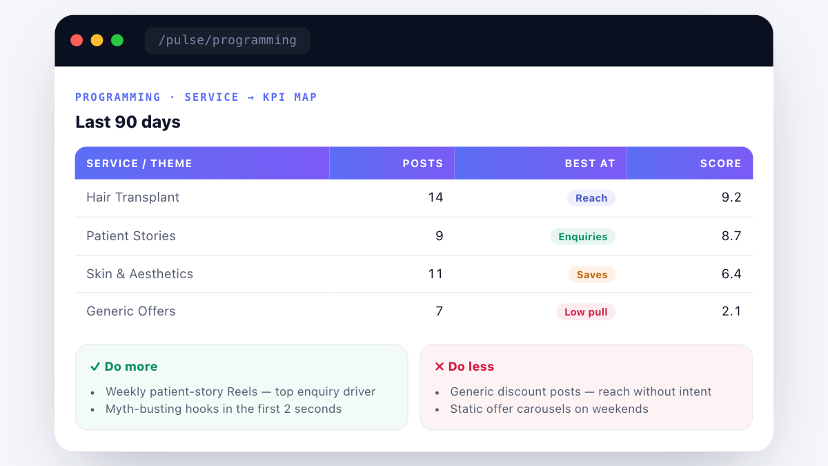
Here is an anonymised map from a Nova Fertility & Skin-style account after 90 days of tagged posts inside Prism Pulse.
| Service / theme | Posts published | Best at driving | Score (0-10) |
|---|---|---|---|
| Hair transplant | 14 | Reach | 9.2 |
| Patient stories (IVF) | 9 | Enquiries | 8.7 |
| Skin and aesthetics | 11 | Saves | 6.4 |
| Cost-transparency explainers | 7 | Saves | 6.9 |
| Doctor-led explainers | 6 | Trust | 5.8 |
| Awareness-day posts | 4 | Community | 3.1 |
| Generic discount posts | 7 | Low pull | 2.1 |
The clear signal: hair transplant content is doing the reach heavy lifting, patient stories are doing the enquiry heavy lifting, and generic discount posts are quietly damaging the account by attracting low-intent traffic. The action from this map: weight next month heavier on patient stories (if enquiries are lagging) or hair transplant (if follower growth is stalled), and retire the generic discount posts entirely.
How to build the service-to-KPI map without Prism Pulse
If you are not on Prism Pulse yet, the framework is still runnable manually. It takes 3-5 hours per account for the first build and 20 minutes per month to keep current.
- Export the last 90 days of posts from Meta Business Suite as a CSV.
- Tag each post by service line in a new column — hair transplant, IVF, skin, aesthetics, cost transparency, patient story, doctor-led, awareness, discount, other.
- For each post, tag the KPI it moved above the account's median — reach, saves, enquiries (if you can attribute), or none.
- Group by service, count posts and KPI winners, and compute an average score per service.
- Read the map: which services are winning which KPIs, which are consistently low-pull.
This is exactly what the Prism Pulse Programming view automates. If you are running this manually across 8+ accounts a month, the labour cost is significant — one of the reasons agencies move onto the console.
How the map should change the monthly calendar
The service-to-KPI map is only useful if it changes what gets published next month. Three specific calendar decisions should get made in every monthly review meeting once the map is in place.
First, which KPI is under pressure this month. Enquiries below target? Weight enquiry-driving services heavier next month. Reach plateaued? Weight reach-driving services heavier. Both healthy? Balance the mix and use the space to test new service themes.
Second, which services are consistently low-pull. Retire them. This is often the hardest conversation with founders because a service line the clinic considers commercially important might be a low-pull performer on Instagram. That is not a signal to keep publishing it — it is a signal that this service needs a different channel (SEO, direct sales, referrals) rather than Instagram.
Third, which services are winning but under-published. Double down. If cost-transparency content is scoring 6.9 with only 7 posts in 90 days, publishing 12 next month is the obvious move — the ceiling is above where you are.
Where the service-to-KPI map fits in the broader stack
The service-to-KPI map is an Instagram-first framework, but the vocabulary carries across channels. The same map should exist for Google Business Profile posts (where local intent behaves differently by service) and for paid Meta Ads (where creative-to-service mapping determines cost per qualified lead). Prism Pulse handles the Instagram version. ICG's Angryturtle handles the Google Business Profile version. Together they give an agency a coherent view of which services are working on which channel — and where the calendar should shift next month.
Frequently asked questions
 Meta Catalyst IQ long-term comparison view charting Meta Ads performance across quarters with spend, CPQL and volume overlaid" width="1200" height="675" loading="lazy" decoding="async" style="width:100%;height:auto;display:block;">
Want to see Prism Pulse on your own Instagram account? Book a 20-min walkthrough →
Book a free Meta ads account audit.
Raman Soni's team pulls your account, checks CAPI/EMQ, reviews creative for NMC compliance, and shows where CPQL is leaking. 45 minutes, actionable output.
Questions readers ask
about this topic.
The three platforms
behind every ICG engagement.
Beacon
CAPI middleware that fixes Event Match Quality, translates CRM statuses to Meta-standard events, dedups across channels.
Agency OS
Live client dashboard. GSC, GA4, Google Ads, Meta Ads, IVR calls in one view. Login anytime, not monthly.
Phoenix
Clinic revenue intelligence over your PMS. Daily action queue: Prevent Loss, Maintain & Engage, Grow Revenue. 46-centre rollout.
Or book a free 30-min audit to see all three in action on your account.
Healthcare brands
that already run on ICG.
A representative slice of the 150+ healthcare brands ICG has delivered for across India. Most engagements remain under NDA.


What ICG clients say · on video.
"Scale up of organic channels and business consulting. ICG has absolute domain authority in their field."
"Working with ICG transformed how we acquire IVF patients in Gurgaon. They understand the fertility journey from inquiry to consult..."
"What Ichelon accomplished — they got all my ideas and worked over 3-4 months to create an amazing, super-customised website."
The intelligence stack behind this playbook.
Every ICG engagement runs on the Search Intelligence Trifecta — Angryturtle for GMB, SIE for search and AI Overview, YODA for YouTube. Live product screens below.
Need help operationalising this?
Every ICG service is healthcare-only, NMC + DPDP-aware, and built around the patient-research patterns that drive Indian healthcare growth in 2026.
More from
ICG.
Healthcare AIO is the discipline of getting your clinic or hospital cited inside Google AI Overviews, ChatGPT and Perplexity answers — not j...
Conversational-search advertising places brand messages inside AI chat answers — ChatGPT, Perplexity, Copilot — rather than beside a results...
NABH digital compliance means every claim, image and testimonial your hospital publishes online matches what an accreditation surveyor can v...
Stop guessing.
Book a Diagnostic.
30 minutes. Free. With the AI-powered healthcare-only marketing agency 150+ brands already run on. No slides, no pitch, no hard close.


